Skip Navigation
How do you begin combining data from cloud applications with your internal databases to gain insight into your business? Maybe your organization has already standardized on Microsoft Power BI as your analytics tool, but you're still learning about using it with multiple data sources.
To analyze data from diverse sources, you need a data warehouse that consolidates all of your data in a single location. Most businesses take advantage of cloud data warehouses such as Amazon Redshift, Google BigQuery, or Snowflake.
You can extract data that you have stored in SaaS applications and databases and load it into the data warehouse using an ETL (extract, transform, load) tool. Once the data is available, your analysts can use it to create reports. In this post, we'll look at how to start from scratch and create a report using Power BI.
Three tiers of the data analytics architecture
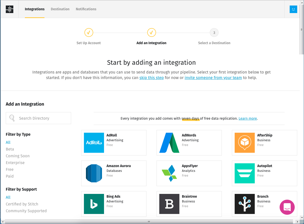
We'll start with Stitch, a simple, powerful ETL service for businesses of all sizes, up to and including the enterprise. It can move data from dozens of data sources. Sign up and you can be moving data to a data warehouse in five minutes. Choose at least one of Stitch's integrations as a data source. Most businesses get more value out of their data as they integrate more data sources; for our example, we'll look at data from two separate sources.
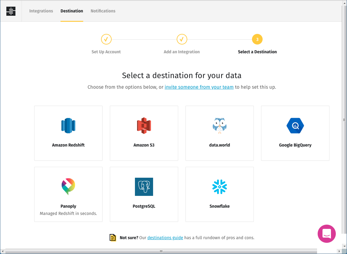
If you don't already have a data warehouse, one of the easiest ways to get one is by using Panoply, a platform that provides a managed version of Redshift. You can set up a Panoply destination easily from within Stitch. At the Select a Destination screen, click on Panoply, click on Create a New Account, and follow the prompts. Stitch will use the email address you logged in with, autogenerate a secure password, and set up a database destination. Save your login credentials so you can access your new data warehouse in the future.
For illustration purposes, I'll use Stitch's own corporate data, which we store in an Amazon Redshift data warehouse. Redshift was one of the first entrants in the cloud data warehouse market, and it remains a popular choice.
Microsoft Power BI serves as the third layer of our data analytics stack. Power BI differs from BI tools such as Looker, Chartio, Periscope Data, and Mode in that it doesn't depend on or expose any SQL code to power its queries. Arguably, a completely visual report builder like Power BI should be easier for business users to learn than a query language like SQL. In practice, though, Power BI's user interface is fairly complex, so it takes time to learn, just as SQL does. To use it well, you have to understand many of the same concepts you should know about for writing SQL queries.
Microsoft offers a free Windows-only Power BI Desktop application (which is what I used), the cloud-based Power BI Pro tool, and an on-premises Power BI Report Server.
If you're a Power BI beginner, don't expect to download the software and jump right in. View some tutorials, or buy a book that can introduce you to the user interface and the process of building a visualization. I found "Supercharge Power BI: Power BI Is Better When You Learn to Write DAX" helpful.
Building a sample report
I got approval from our CEO to share some of Stitch's real data for this exercise. I'll use data from a table in one of our back-end product databases to select all of our active clients, and join that list against another table that tracks the number of Google Analytics connections our clients have established. I'll create a report that shows the number of connections to Google Analytics over time, filtered to include only active clients.
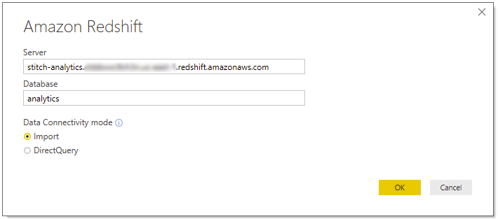
To start, I clicked on Get Data in the ribbon on the Home tab, found Amazon Redshift, and entered the names of our Redshift server and database. (If you're using a Panoply data warehouse, you should still select Amazon Redshift, but use db.panoply.io as the server you're connecting to.) You can choose to import data or use a direct query. I chose the former, because I'm fine with a snapshot that I can update as needed. If you're working with a large number of records, or data that needs to be accurate in near real time, you'd be better served by using DirectQuery.
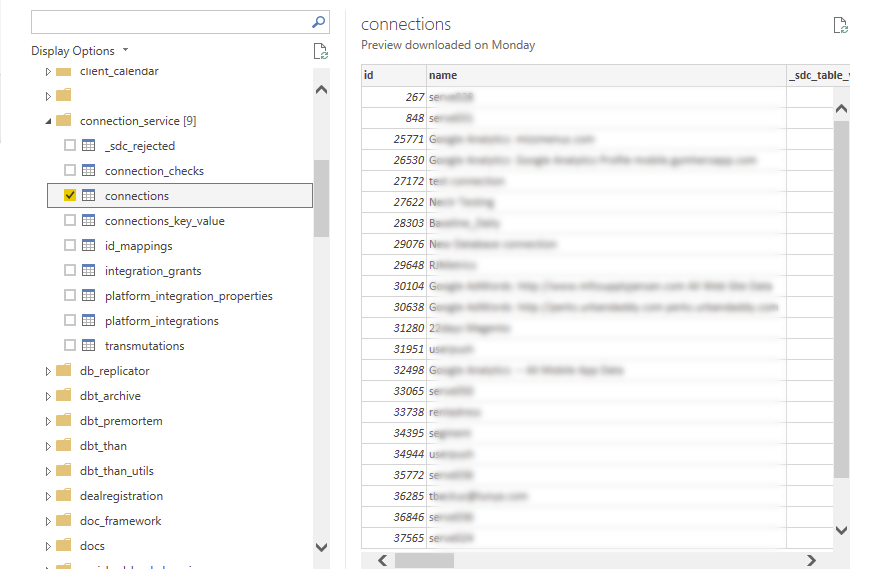
Power BI brings up a Navigator window that lets you select data sources. I started with the connections table in our connections_service schema, which keeps a record of all the connections our clients make to data sources.
I clicked on the Data view in the far left column of the Power BI Desktop window to facilitate preparation of the data. I needed only three columns from the connections table, so I removed the others by right-clicking on their names and choosing Delete from the drop-down menu.
For each connection I needed a properly formatted date to use as a sort field and to display results by month. To create this field, I added a new column to the data to contain a formatted version of the createdat timestamp from the connections table. On the Modeling tab I chose _New Column, and specified the formatting I wanted on the this field using Power BI's Data Analytics Expression (DAX) language.
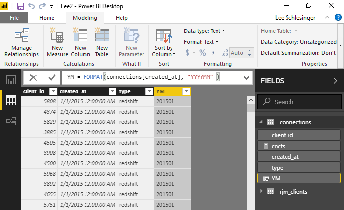
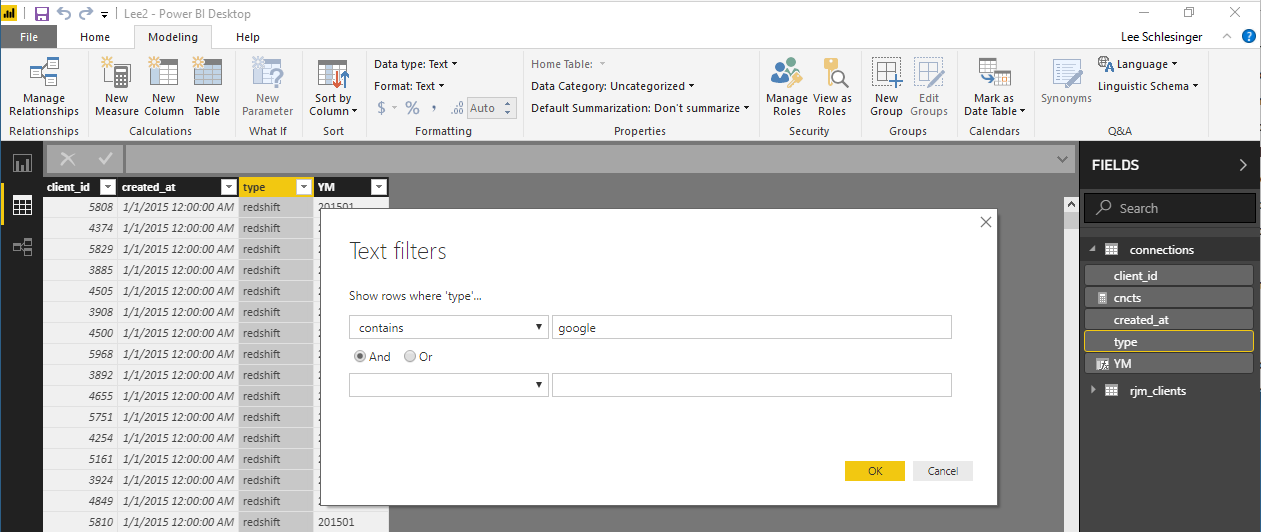
Since I was only interested in connections related to Google Analytics, I also set up a text filter on the type field to limit my query to just rows that contain the string google.
Next, I returned to the Navigator and imported data from another source: the rjm_clients table from our platform schema, which holds all the information about our clients. Again I removed the columns I didn't need, preserving only the client ID and a Boolean indicator of whether the client was active.
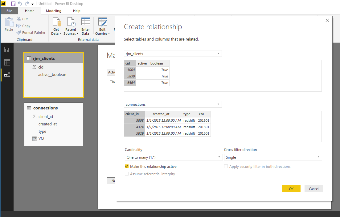
Now I had to tell Power BI how to link the two tables. I clicked the Relationships button at the left side of the window to bring up the Relationships view, then the Manage Relationship button on the ribbon in the Home tab. From this screen you can set up foreign key relationships by associating key fields across tables; I associated the client IDs.
Now that I had all the data I wanted (and none that I didn't) and had it filtered and joined appropriately, I was ready to represent it visually, by switching to the Report view.
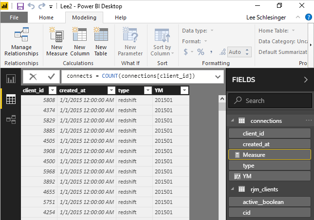
Here I created a new Measure – a calculation on the data, which you create using a DAX function. I defined a measure called connects with the function COUNT(connections[client_id]); in this syntax, connections is the table and client_id is the field name.
Next, I clicked on the line chart icon in the visualizations pane. I dragged the YM column from the Fields pane to the Axis field. I dragged Type to the Legend field. And I dragged the connections measure to the Values field.
Once I got a first look at the data, I realized I was seeing farther back in time than I cared about. You can create filters in the report pane, just as we did in the data pane when we limited the type field to show only values that contain google. That's one of the many places where Power BI provides more than one way to accomplish the same thing. I specified that I wanted to see only records since October 2015.
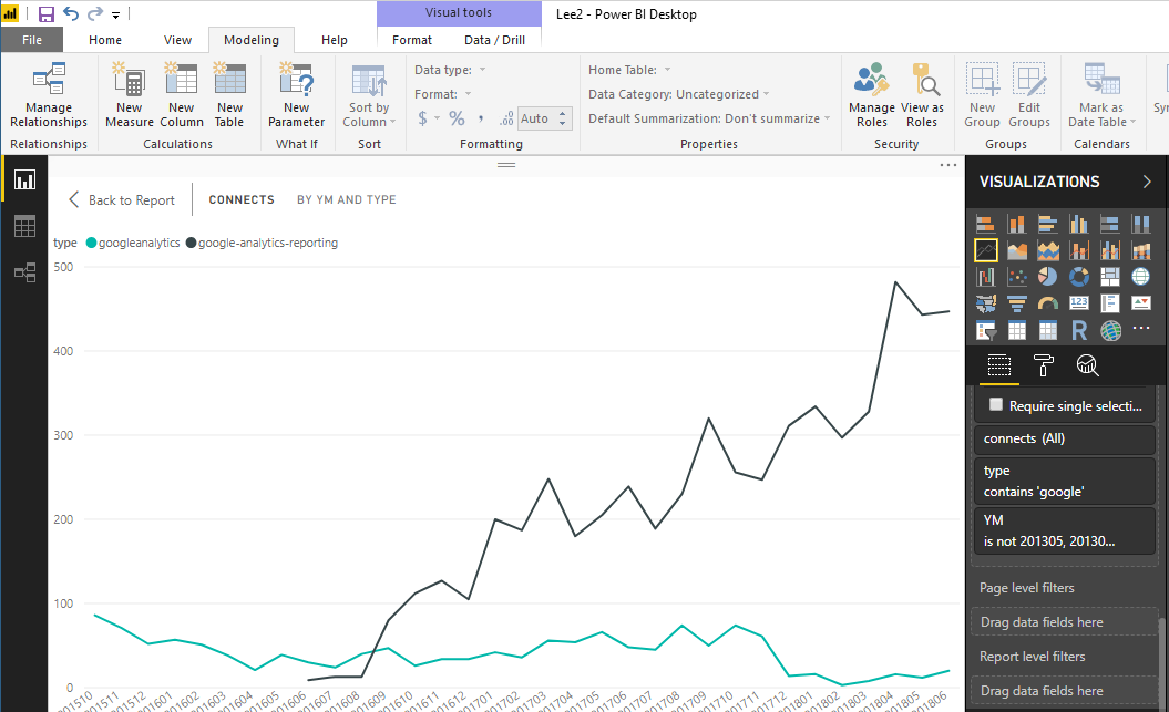
At this point I had accomplished what I set out to do – create a useful visualization of our data. In it we see a couple of different data sets: an older version of our GA connector that was based on an old Google API, whose usage is trending down, and a newer version that we introduced more recently that uses the Google Analytics Reporting API, for which usage is growing. A report like this would be useful to our product team as it watches new, improved versions of our technology take over from old ones we're phasing out.
Power BI gives you many more options than I've covered here. In addition to the 29 visualizations bundled in the Desktop interface, you can click on an icon to visit a Power BI Visuals Marketplace, where you can download any of hundreds of additional visualizations for free. You can make many kinds of adjustments to the appearance of a report. And when you're satisfied with your report, you can publish it to the Power BI Report Server, or to a website.
So there you have it – a quick walk through the process of using an ETL tool like Stitch to move data from multiple sources into a data warehouse, then report on it using Power BI. Sign up for a free trial of Stitch and start creating your own.
Give Stitch a try, on us
Stitch streams all of your data directly to your analytics warehouse.
Set up in minutesUnlimited data volume during trial