Skip Navigation
You've heard it since grade school — a picture is worth a thousand words. Humans are visual beings, which makes data visualization the best way to enhance data-driven decision-making.
What is data visualization?
Data visualization is defined as "the visual representation and presentation of data to facilitate understanding." Visualizing data can reveal trends and insights that would otherwise remain obscure and help data analysts and data scientists communicate their findings with nontechnical stakeholders.
Dundas BI, one of many data visualization platforms, has written a brief history of data visualization. A few years ago, creating a data visualization might have involved several tedious steps:
- Query a database.
- Export the results to Excel.
- Create a pivot table.
- Create a chart from the pivot table.
- Copy/paste or link the chart into PowerPoint.
A more effective and efficient solution is to feed data into a data visualization tool like Tableau, Power BI, Periscope Data, or Google Data Studio. These self-service business intelligence platforms make it easy for any user to leverage big data to gain business insights.
Find the fastest path to data visualization
Importance of data visualization
Data doesn't exist in the physical world. You can't touch it, and you can't see it — but you can see a representation of it. Pundit Stephen Few said in "The Encyclopedia of Human-Computer Interaction" that data visualization allows us to "find a way to give form to that which has none." He sums up the need for data visualization by saying:
You could stare at a table of numbers all day and never see what would be immediately obvious when looking at a good picture of those same numbers.
Human perception is at the heart of data visualization. Our brains process visual data faster and understand it better than textual data. Think about trying to determine when high tide arrives: You could find a peak on a line chart faster than finding a time among the rows and columns of numbers in a tide table.
Benefits of data visualization
Presenting data visually has benefits over displaying it textually:
- Data can be understood more quickly and more easily.
- Nontechnical stakeholders can draw insights from data that might otherwise be incomprehensible to them.
- Data visualization can reveal comparisons, trends, rankings, relationships, and outliers.
Types of data visualization
The message you want to convey dictates how to best visualize your data, and the variety of visualizations available means there's one suited to every purpose.
Comparisons
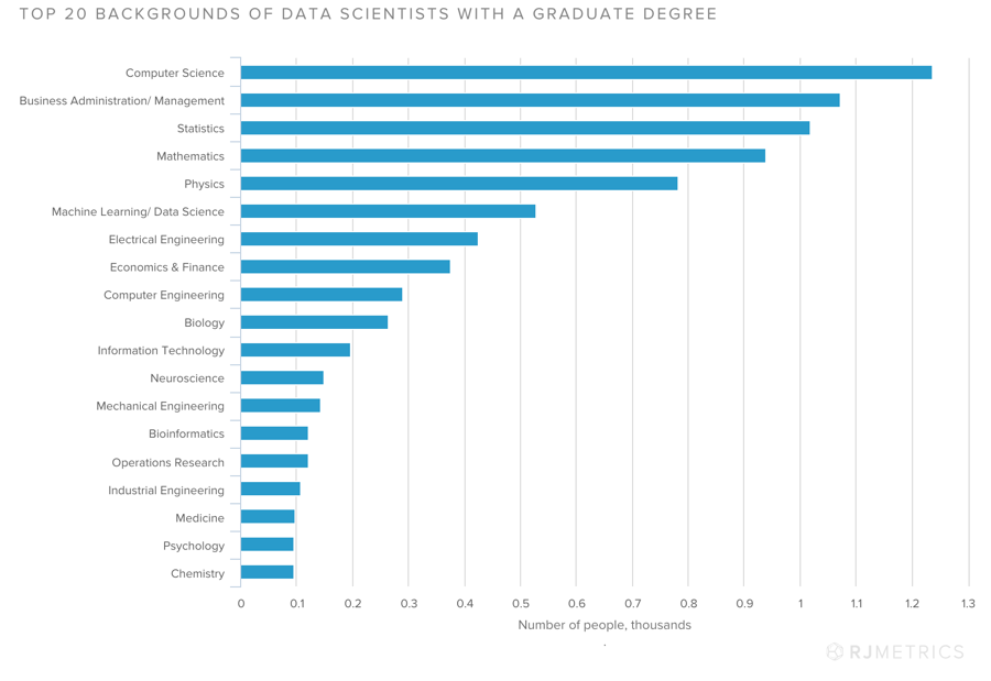
Bar charts and column charts are great at showing comparative data, such as sales per region. Stacked bar charts are a good variation for a series, such as sales per region by product.
Bar chart, via Stitch
Rankings
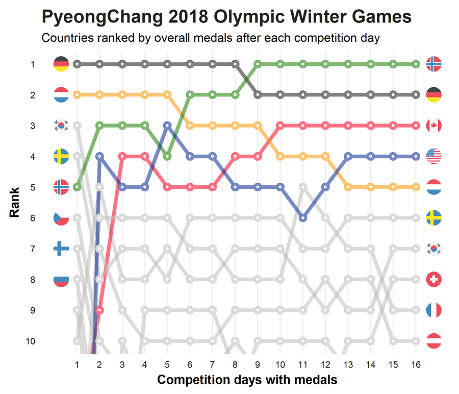
Bump charts are ideal for showing rankings over time. In addition to showing movement in the rankings, colors can be used to highlight items of greater interest, such as most improved or overtaking a leader.
Bump chart, via Dominik Koch
Visualizing rankings for a single moment in time can be done with a simple bar chart.
Trends
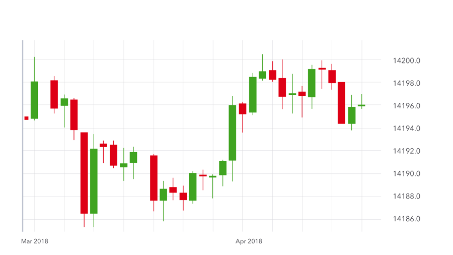
Line charts show trends, such as year-over-year sales. If you're dealing with a range of values, such as in stock trading, a candlestick chart is better.
Line chart, via Stitch
Candlestick chart, via IG
Relationships
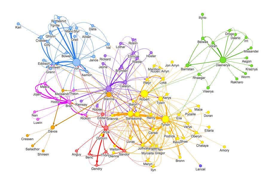
Network graphs are best for showing relationships between objects or people. Family trees and org charts are classic examples of network graphs.
Network graph, via William Lyon
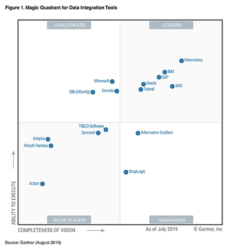
Scatter plots show the relationships between two variables. Gartner's Magic Quadrant is an example, plotting a company's completeness of vision and ability to execute.
Scatter plot, via Gartner
Proportions
Visualizations used to show proportions include the pie, donut, bubble, funnel, and Nightingale rose chart, which was indeed created by Florence Nightingale.
How to create data visualizations
Data visualizations require high-quality data from multiple sources to generate business insights. An enterprise can use a data warehouse built for analytics to centralize its data for visualization. Cloud data visualization platforms typically include connectors for cloud data warehouses such as Amazon Redshift, Google BigQuery, Microsoft Azure Synapse, and Snowflake.
Once the reporting platform is connected to the data warehouse, you can start creating visualizations. There's often a tradeoff between ease of use and visualization flexibility, as more flexibility adds more complexity. However, most of the platforms make it easy to create standard visualizations. Some automatically select a type of chart based on the type of data you use in the visualization, though you can select a different type.
Creating visualizations using the tool's dashboard can be simple or involved, depending on the complexity of the visualization at issue. Expect to invest time learning how to use the dashboard.
Data visualization tools
Let's take a look at a few commonly used data visualization platforms.
- Tableau Tableau is a leading data visualization platform according to Gartner and Forrester; Forrester went so far as to call it the "gold standard of enterprise BI." Salesforce acquired Tableau in August 2019, but Tableau continues to operate as an independent division.
Tableau is known for being feature-rich but difficult to learn. It can handle most anything you want to visualize. Its "show me" feature guides you and suggests which type of chart best may best fit your data. Natural language query capabilities help simplify creating visualizations.
- Periscope Data
Periscope Data is a graphical BI platform for people who love SQL, Python, and R. Nontechnical users can extract meaningful insights using prebuilt charts, while data scientists can create customized visualizations. Periscope was acquired by Sisense in 2019.
Microsoft Power BI Microsoft Power BI is better suited for creating business intelligence reports than doing in-depth analysis. Data scientists would likely prefer Tableau or Periscope. If you are a MIcrosoft Azure shop, Power BI is worthy of consideration.
Google Data Studio
Google Data Studio's capabilities are limited in comparison to more mature products like Tableau or Periscope. Connectors for Google data sources are included, and users can purchase partner connectors for non-Google data sources.
Data Studio features an intuitive interface that makes it easy for business users to generate visualizations. This friendly UI comes at the expense of flexibility, as the ability to customize visualizations is limited.
Try Stitch with your data warehouse and favorite data visualization tool today
Distinguishing features
If you haven't already standardized on a visualization tool, how should you choose between them? Consider these important factors.
- Ease of use
If a tool will be used by nontechnical stakeholders, choose a tool with an intuitive interface that simplifies the process of creating visualizations.
- Support for visualizations
Verify that a tool supports all the data visualization types you require.
- Mobile support
If many users are on mobile platforms, choose a tool that supports viewing visualizations from mobile devices.
- Security
If you're visualizations access sensitive data, choose a tool that offers encryption capabilities or other data security features.
- Augmented analytics
Consider whether you would benefit from augmented analytics (also known as augmented data discovery), which uses machine learning and artificial intelligence to determine what insights an enterprise can derive from a given data set.
Data visualization uses in the enterprise
Data visualization can benefit enterprises in almost any industry. Let's look at a few examples.
- Marketing
How can a company know how to best allocate its marketing budget? Data is key. Data visualization can help an enterprise measure the effectiveness of a campaign, track social media engagement, or measure pay-per-click performance. Data visualization can bring self-service marketing data analysis to sales and marketing professionals who are not trained data analysts.
- Health care
Improving patient outcomes and reducing the need for patients to return to the hospital are top objectives of health care professionals. Often, these professionals have trouble meeting these goals because it's difficult to create a comprehensive view of a patient's medical records. Data visualization allows providers to quickly understand all of a patients' information. It can also help medical facilities improve operations by, for instance, optimizing nurse-to-patient ratios.
- Travel
The travel industry is built around customer interaction. On-time performance, customer satisfaction, and occupancy rates are just a few of the data points that travel companies can use to gain actionable insights. Data visualization makes it possible to share those insights throughout the organization.
Prepare your data for visualization
The more data sources you can extract data from, the better your analytic results are likely to be. Stitch can replicate data from more than 100 sources to your cloud-based data warehouse, where data visualization and analysis tools can access it. But don't take our word for it — try Stitch today.
Give Stitch a try, on us
Stitch streams all of your data directly to your analytics warehouse.
Set up in minutesUnlimited data volume during trial